Looking at tables of any substantial size is a little like looking at the grooves of a record with a magnifying glass. You can see the data but you will not hear the music. - RJ Andrews, Info We Trust
Unlike many other families of data graphics, music visualizations are rarely burdened with the responsibility of solving numerically oriented problems. However, there is still a gradient of effectiveness for the task of “visually describing something that is not visual” (Jason Forrest), whether for artistic or other goals. Without the right balance of structure and unpredictability, musical data graphics can be forgettable noise.
Effective music visuals enhance listening experiences by making the beauty of sound structures visually salient. They may help in ways hard to explain in words, but easily understood when experienced. While viewers will have their attention split between auditory and visual channels, compelling visualizations achieve synergy where noticing something interesting in one channel corresponds with interesting output in the other.
Despite not being used for direct problem-solving, music visualization producers still face technical challenges. Few data applications outside of high frequency trading or cyber-physical systems have sub-second latency requirements. In contrast, synchronizing sound to visuals requires very short delays to be convincing. People feel that something is “off” when TV broadcasts are out-of-sync with the audio. Humans are sensitive to lags of as little as 2 ms, and have reduced task performance with lag of as little as 50 ms (source). Additionally, music data comes in many forms (discrete notes, or continuous sound waves). Working with raw sound files will lead makers down the path of learning digital signal processing.
This is a small collection of resources for progammatic live music visualization.
Structured: Music Animation Machine
When I think of classic “piano roll” style animations, I think of Stephen Malinowski’s work. 677 videos and counting!
Read about how it’s made - MATLAB, Excel, Adobe Premiere…
Featured in Edward Tufte’s seminars, Stephen has explored tens of rendering techniques for animating musical notes since 1985. Jason Forrest recently wrote about this “MIDI Sequencer” approach.
I have a few ideas about why these animations are so popular.
The first time I hear a piece of classical music, I’m often overwhelmed by the complexity- there are so many instruments at play, and there is limited repetition. On subsequent listens, my ears learn to decompose the sound into parts (melodies, harmonies, voices), and to track the progress of those parts individually over time. I don’t think I started to appreciate classical music until I learned to play this tracking game. I think visuals like Stephen’s guide people towards discovering this game on their own.
I believe that most people are likely to have greater skills in visual than musical tracking because it’s exercised more frequently in daily life. However, musical decomposition and tracking is learnable skill, and having a visual aid such as a “visual piano roll” grants listeners of all experiences enhanced abilities to focus on parts of a musical performance.
Researchers in other aesthetic fields (such as humor) noticed that people enjoy things that strike a balance between being reassuringly familiar, and tantalizingly novel. With these animations, even viewers new to a piece can enjoy the satisfaction of successfully predicting when interesting musical events will happen in the song. This can happen through tracking the approaching visual forms (such as peaks or valleys), much like watching for incoming planes on the horizon. However, listeners do not know how those visual forms will directly turn into sound. This constant ebbing and flowing of built tension through anticipation, and contentment through successful prediction is something that people may find enjoyable.
Producing structured visuals like these requires access to musical score data or MIDI files, which is part of why so many of Stephen’s pieces illustrate classical works- the sheet music is in the public domain. However, there is hope even if you do not have access to sheets for a song that you’re interested in- Google’s Magenta.js offers machine learning models for transcribing raw sound files into the music notation necessary to power your own structured music visualizations.
Unstructured: Spectrograms
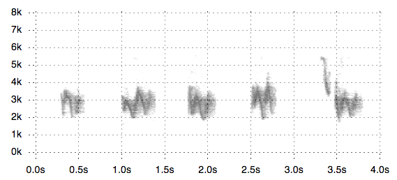
Many media players (Windows Media Player, iTunes, etc) ship with some form of “music visualizer” that associates properties of raw audio files with visual encodings, but the mapping is a bit stretched. Spectrograms, originally designed for scientists analyzing signals, are usually less trippy, but are no less capable of entrancing viewers.
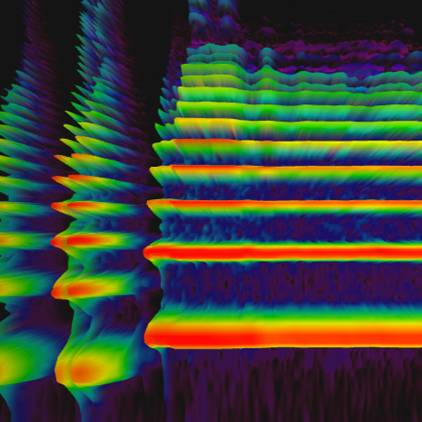
Google’s 3D spectrogram visualizer is part of the Chrome Music Experiments family of digital toys. Here’s how to interpret it:
- X axis represents time
- Y axis represents frequency
- Z axis (and color) represent intensity (given that 3D warps perspective, redundant visual encoding is appropriate)
I consider this is an appropriate use of 3D visualization, for at least 3 reasons in addition to aesthetics.
- The user is interested in relative comparisons, but isn’t trying to precisely determine what data values correspond to the heights and colors represented in the graphic, so data distortion from an aerial perspective is not damaging.
- The domains for all 3 data dimensions are known and bounded in advance
- The camera is stationary, so the user cannot put themselves into a bad state where data is consistently occluded.
For more on appropriate usage of 3D, I recommend the notes from Alli Torban’s Dataviz Today Podcast.
While I claim that most musical visualizations are not meant for problem solving, that is not always the case.
At a recent healthcare hackathon, a unique application for this tool arose. I met Konrad, a UX Designer and fellow Cognitive Science enthusiast. Despite losing his larynx to illness, he was determined to learn to sing using a manually modulated digital speech device. He was interested in prototyping a tool that would let him get immediate visual feedback about the closeness of frequencies produced by his device to target frequencies of his choice. This application would help him learn to control his digital voice box in a way that might let him sing again. We explored a small part of how this tool might work by playing with the built-in microphone mode of the Google spectrogram. You can find a partial commercial implementation of this idea in the iOS App, “Vocal Coach” Vanidoo.
To make visualizing sonic data easier, Jim Vallandingham created SpectrogramJS for visualizing birdsong. These visuals are featured in the 1966 book Birds of North America, although they are described as sonagrams.
Just for Fun
A few of visuals and sound intertwined in ways that I don’t have a category for:
- NYTimes: Diary of a Song: Bieber, Diplo, and Skrillex
- Regardless of your feelings for Justin Bieber or Skrillex, if you’ve made it this far through my post, you’ll probably enjoy how the NYT animated the creative process of iterating on a song. Here’s the rest of the “Diary of a Song” video series.
- Doodle Rider: In the Hall of the Mountain King
- This technique works especially well with suspenseful songs. Acceleration happens simultaneously sonically and visually.
- Doodle Drums
- Animusic
- This feels further outside the territory of “data visualization” and more in the pure animation realm.
- Doodle Music (Vi Hart)
- The sound-visual connection is more abstract than in the others because it is hand-drawn, but it is still fun to track. The precision of the mapping is less important than getting the general “shape” of the sound correct.
Closing
I opened this post with a quote that struck me from RJ Andrew’s book, Info We Trust. While it’s not really a quote about music, I feel that it hints at the potential unlocked by the right visualizations. Many people may be content to simply listen to music, and not think about how the sound could be visually represented. I believe that this is similar to just looking at the grooves of a record, in that it’s the intuitive thing to do if you’ve never heard of a record player. While I don’t think that Piano Roll Sequencers or Spectrograms are to seeing music as record players are to hearing music, I think they are a step in that direction. More importantly, I think they offer exciting ideas for making visuals that bring people joy, and complement existing experiences rather than trying to stand alone.
I hope you enjoyed browsing these examples. Please let me know if you find any similar ideas that have helped you to listen with your eyes.
Thanks to David Rubenstein and Jason Forrest for feedback on earlier drafts.
Footnotes
- For a final project in a class about music and sonification, I produced some interactive charts using MIDI data in a Beaker Notebook. This was an open source project from Two Sigma that let users mix Javascript and Python code within the same notebook environment. The site for hosting these projects was been taken down when Two Sigma retired Beaker Standalone in favor of contributing to the Jupyter ecoystem, but I might try to port part of my project to a standalone webpage another time.
- I haven’t spent time with real-time audio livecoding, but I’ve heard tools like SonicPi and Supercollider useful for those applications.
- A future post might touch on non-live programmatic music visualization.
Update 4-2-2019
Carlos De la Guardia wrote in with the following comment:
I quite agree with your thoughts on Malinowski’s visualizations of classical music. I also think they’re a great aid to memory, not only foresight and the division of a piece into voices and motifs. That is, it’s much easier to spot the restatements of a musical idea when a visual representation is available, and a large part of classical music is understanding how different moments in a piece are related to each other.
He also shared two posts he had written exploring a variety of novel ways to visualize music. The first post includes a variation on a spectrogram called a chromagram carlosd.org/perfekt) which bins the frequencies into buckets corresponding to the 12 chromatic notes, and a “pairwise comparison” visualization inspired by what Martin Wattenberg’s termed “dotplots” in his paper about music visualizations through arc diagrams. His second post shows 9 ways to visualize different features of the same song using the python library librosa, including volume, melody, and dynamism. It also includes instructions for how to read the boxy “repetition” diagrams, which are also featured in the Vox video music on earworms in music (below).